2024 - Dec - 31

Our Newsletter
December 31, 2024
 |
|
|
|
|
The 3 Reasons You Need a Mobile-First Website for Your Business
In today's digital landscape, having a strong online presence is crucial for the success of any business. And when it comes to your website, taking a mobile-first approach is no longer just a nice-to-have - it's a necessity. Here are the top 3 reasons why your business needs a mobile-first website:
1. Mobile Dominance More than half of all internet traffic now comes from mobile devices. In fact, mobile usage has officially surpassed desktop in recent years. This means that the majority of your potential customers and clients are accessing your website from their smartphones and tablets. If your website is not optimized for mobile, you're missing out on reaching a huge segment of your audience.
2. Improved User Experience A mobile-first website provides a seamless, user-friendly experience for visitors on any device. From easy navigation and lightning-fast loading times to content that is structured and sized appropriately for smaller screens - a mobile-first approach ensures that your website looks great and functions flawlessly, no matter how someone is accessing it. This enhanced UX can lead to higher engagement, reduced bounce rates, and ultimately, more conversions.
3. SEO Benefits Google has made it clear that mobile-friendliness is a ranking factor in their search algorithm. Websites that are optimized for mobile performance are more likely to rank higher in search engine results pages (SERPs) than those that are not. By adopting a mobile-first mentality, you're setting your business up for better visibility, more organic traffic, and improved chances of being discovered by your target customers.
The bottom line is this: in our mobile-driven world, having a website that is designed with mobile users in mind is no longer optional - it's essential. Investing in a mobile-first website can give your business a major competitive advantage and help you reach, engage, and convert more of your ideal customers.
Is your current website up to par when it comes to mobile optimization? If not, there's no better time than now to make it a priority. Your business - and your bottom line - will thank you. |
|
Secret Little Hack |
|
Utilize lazy loading for images and videos to ensure faster loading times and improve user experience. |
|
The Digital Advantage: How Solopreneurs Can Leverage Websites in Business |
|
As a solopreneur, you wear many hats - from CEO to salesperson, to marketing manager, and more. The internet can be your greatest ally in this journey, providing you with tools that can streamline your operations, boost your marketing efforts, and enhance your overall productivity. One of the most effective of these tools is a well-crafted website. Here's a short guide on how solopreneurs, especially those with portfolios, can benefit from having a website:
1. Showcase Your Work: For portfolio-based professionals like photographers, graphic designers, writers, and artists, a website serves as a digital portfolio. It provides a platform to showcase your work, highlight your skills, and present case studies. Potential clients can easily view your previous work, understand your style, and determine if it aligns with their needs.
2. Establish Credibility: Having a professional, well-designed website can significantly boost your credibility. It shows potential clients that you take your work seriously and can provide the level of service they expect. A website also allows you to share testimonials from satisfied clients, further enhancing your credibility.
3. Reach a Larger Market: By making your portfolio and services available online, you're no longer limited to your local area. Your website allows you to reach potential clients from all over the world, opening up a vast array of new business opportunities.
4. Improve Accessibility: Unlike physical stores that have set operating hours, your website is accessible 24/7. This means that potential clients can view your portfolio, learn about your services, or even book appointments at any time that suits them.
5. Marketing Tool: Your website can also serve as a powerful marketing tool. With strategies like search engine optimization (SEO), you can make your site visible to people searching for the services you offer. Additionally, integrating your site with social media allows you to reach a larger audience and drive more traffic to your site.
6. Communication Channel: Finally, your website can serve as a direct communication channel with your clients. From contact forms and booking systems to live chat features, it enables clients to easily get in touch with you.
In conclusion, for solopreneurs, a website is more than just a digital business card. It's a powerful tool that can enhance your credibility, showcase your skills, and expand your reach. So if you're a solopreneur without a website, it's high time to invest in one. It might be one of the most important business decisions you make. |
|
Joke Of The Day |
|
Why did the website go to therapy? Because it had too many break points! |
|
|
The internet has revolutionized the way we do business and this is particularly true for those of us with side hustles. Whether you're a freelance designer, a budding e-commerce entrepreneur, or a weekend event planner, the internet can provide a wealth of opportunities to grow your sideline business. Here are some key benefits of harnessing the power of the internet for your side hustle:
1. Broadening Your Reach: Having a strong online presence, be it through a website or social media platforms, allows you to reach a larger and more diverse audience. You're no longer limited to your local community or network - your potential customer base is global!
2. Operating Around the Clock: Unlike a traditional brick-and-mortar business, the internet never sleeps. This means that your customers can browse your products, book your services, or send inquiries 24/7. This flexibility is especially beneficial for side hustlers who may not have traditional business hours.
3. Cost-Effective Marketing: The digital world offers a wide range of affordable marketing opportunities. From social media advertising and email newsletters to blogging and search engine optimization (SEO), you can create a robust marketing strategy without breaking the bank.
4. Showcasing Your Work: If your side hustle involves creating something - whether it's beautiful handcrafted jewelry, stunning photography, or engaging blog posts - the internet provides the perfect platform to showcase your work and attract potential customers.
5. Building Relationships: The internet allows for immediate, direct communication with your customers. Responding to comments on social media, answering emails promptly, or engaging with your audience through a blog can help you build strong relationships and foster customer loyalty.
6. Learning and Development: The internet is a treasure trove of resources that can help you grow your side hustle. From online courses and webinars to forums and blogs, there's a wealth of knowledge at your fingertips.
7. E-Commerce Opportunities: For those selling products, setting up an online store can be a game-changer. Platforms like Etsy, eBay, or Shopify make it easy to create a professional-looking store and handle everything from payment to shipping.
In conclusion, the internet offers a plethora of tools and opportunities for side hustlers looking to grow their business. By taking advantage of these resources, you can reach a wider audience, market your business more effectively, and build stronger relationships with your customers - all while juggling the demands of your full-time job. Embrace the digital shift and let the internet propel your side hustle to new heights! |
|
Q/A Questions |
|
Q: What is a mobile-first website? A: A mobile-first website is a site that is designed and developed with the primary focus on providing a seamless user experience on mobile devices, such as smartphones and tablets.
Q: Why is it important to have a mobile-first website? A: Having a mobile-first website is important because a large percentage of internet users access websites on their mobile devices. By prioritizing mobile optimization, businesses can ensure that their website is accessible and user-friendly for a broader audience.
Q: How can I make my website mobile-first? A: To make your website mobile-first, you can start by choosing a responsive design that automatically adapts to different screen sizes. You can also optimize images and content for faster load times on mobile devices and prioritize mobile-friendly navigation and touch interactions. Regular testing and updates are also important to ensure a smooth user experience on mobile. |
|
|
|
Mastering the Header Options in Your Mobile and Desktop Site Editor Page
The header of your website works as the most significant part of your site's branding. It's the first thing your visitors see, it sets the tone for your site, and it's the reference point that allows easy navigation. In both mobile and desktop versions of your website, the header options under the options menu provide the tools you need to create a powerful first impression. Here's an in-depth look at the header options available under this menu selection:
1. Logo: This option allows you to upload a logo that represents your brand. You can choose its alignment, adjust its size, and even decide if it should appear on all pages or only on the homepage.
2. Site Title and Tagline: If you do not have a logo, you can utilize this option to display the name of your website (site title) and a short phrase that describes your site (tagline). These elements are crucial for SEO and user recognition.
3. Primary Menu: This is the main navigation menu that usually includes links to the different sections of your site like 'Home', 'About Us', 'Services', 'Contact Us', etc. You can customize this menu to include whatever links are most useful for your visitors.
4. Secondary Menu: This is an additional menu that you can use for extra links or functionalities. It might include social media icons, a search bar, or a language switcher.
5. Header Image: Some themes allow you to add a header image, which can be a great way to visually represent your brand or the ethos of your site. Make sure any image you use is optimized for both desktop and mobile viewing.
6. Header Widgets: These are dynamic areas in your header where you can place various types of content like text, images, buttons, etc. They provide additional functionality and can enhance the user experience.
7. Sticky Header: This option, if available, allows your header to stay visible at the top of the screen as the user scrolls down. It ensures your site's navigation is always within reach.
8. Header Styles: Some themes offer different header styles – for example, a centered header, an inline header, or a stacked header. Choose a style that best suits your brand and website design.
9. Mobile Menu: This is a condensed version of your primary menu, designed for ease of use on smaller screens. It often takes the form of a 'hamburger' icon which expands when clicked.
Each header option plays a crucial role in shaping the user experience on your website, influencing how visitors perceive your brand and how easily they can navigate your site. As such, taking the time to understand and utilize these options effectively can significantly enhance the effectiveness of your website. |
|
|
Leveraging the Potential of Social Media & Facebook Like Box Widgets in MobileFirst-Personal Editor
In the arena of digital marketing, social media widgets have emerged as powerful tools for enhancing a brand's social media presence. They provide an easy way for visitors to engage with your social media profiles directly from your website. MobileFirst-Personal Editor offers a range of such widgets, including the Social Media Widget and Facebook Like Box Widget. This article will delve into how these widgets can be effectively used to improve your social media reach and influence.
The Social Media Widget
The Social Media Widget serves as a bridge, connecting your website visitors to your social media profiles. Here's how it can boost your social media reach:
1. Promoting Your Profiles: By displaying icons of your social media profiles on your website, the widget encourages your visitors to explore your social media presence, potentially increasing your followers.
2. Encouraging Engagement: When visitors can easily access your social media profiles, they're more likely to engage with your content - liking posts, leaving comments, and sharing your content with their followers.
3. Enhancing User Experience: This widget adds convenience by allowing visitors to connect with your social media profiles directly from your website, providing a seamless user experience.
The Facebook Like Box Widget
The Facebook Like Box Widget is a specialized tool that offers a snapshot of your Facebook page directly on your website. Here's how it can enhance your Facebook presence:
1. Increasing Page Likes: This widget not only displays your Facebook page but also includes a 'like' button, making it easy for website visitors to like your Facebook page without having to leave your website.
2. Boosting Authenticity and Trust: By showcasing real-time activity from your Facebook page, this widget can help in establishing authenticity and building trust among your website visitors.
3. Promoting User Engagement: The widget displays your recent Facebook posts, encouraging visitors to interact with your content. They can like, comment, and share your posts, thereby boosting engagement.
4. Expanding Your Reach: With the embedded 'share' button, users can share your Facebook page with their friends, potentially expanding your reach exponentially.
By integrating the Social Media Widget and the Facebook Like Box Widget on your website, you can create a cohesive online presence that spans both your website and social media platforms. Not only do these widgets provide an easy way for website visitors to connect with your social media profiles, but they also enhance user experience and engagement, ultimately boosting your social media influence. So, make the most of these tools and let your social media presence flourish. |
|
Interesting Facts |
|
|
https://app.letterman.ai/s/mobilefirst-personal |
|
MobileFirst-Personal Websites Connector Plan Create and maintain your own Digital Business Card |
|
Sponsor Spot |
|
This plan offers the ability to create up to 2 websites of 2 pages and includes the BizcCard Template and Widget to allow you to build two separate Digital Business Cards. These professional grade Business Cards can be used for a variety of businesses and can be the initial step in claiming a powerful digital presence on the Internet highway.
|
 |
|
Interested in advertising to our incredible readers? Sponsor MobileFirst-Personal Websites
Update your email preferences or unsubscribe here Montreal, Quebec, Canada |
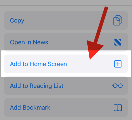
To add this web app to your homescreen, click on the "Share" icon
![]()
Then click on "Add to Home"

To add this web app to your homescreen, click on the "Share" icon
![]()
Then click on "Add to Home"

It looks like your browser doesn't natively support "Add To Homescreen", or you have disabled it (or maybe you have already added this web app to your applications?)
In any case, please check your browser options and information, thanks!
It looks like your browser doesn't natively support "Add To Homescreen", or you have disabled it (or maybe you have already added this web app to your applications?)
In any case, please check your browser options and information, thanks!


