2024 - Nov - 19

Our Newsletter
November 19, 2024
 |
|
|
|
|
I have been involved with mobile first rtechnology, and especially website page buildiong for mobile phones for over three years, the platform that mobilefirst-Perosnal websites is fiormlyanchored in is well over eigh years in the development. It is surdy, powerful and more robust and unified than any other system I have ever seen.
Once the general public begins to understand the power they can weild with theior own websites, I firmly beleive that a paradigm shift, as powerful as the one that occured in the 1980'as when IBM introced the XT - the first economical and versatile Personal COmputers where the entire office and perosnal culture has been radically changed.
The emergence of the mnobile phone as a personal accessory and powerful persoanla andbusimess tool is goind to cause a seriopus shift in the way peole use the enorous computing power tht almost everyone now has access to.in theer hands and in their pockets.
The power of HTML (Hyper Text Markup Language) and its ability to be decoded by the many browsers available has made vital information available to anyone at any time - the increased use of the mobile phone to access it from anywhre is proof to that!
The MobileFirst-Personal Websites platform is made for everyone to use and build a persoanl experience on their phone. It encompasses every aspect that HTML can be used to display on a browswer - websites, landing pages, full e-commerce capabilities and the ability to crerate courses of any kind to pass down the knowledge we are gaining so fast to students anywhere.
It is a complete system, built to be used by anyone with a bit of technical capability, if you can fill out a form, you can get your message out onto the digital highway. If you are advanced in your digital capabilities, the platform is mkore than abnle to accomodate advanced devlopemnt, truly, no user will be left behid, and everyone can use the sytem in some for to communicate with the world.
HTML and websites are no longer the domain of the business and developer, anyone can get their voice onto the internet and be heard. Even if all you want to do is have a close circle of friends keeping their own thoghts and feelings between themselves, al the way to creating and maintaing an e-commerce store with thousands of product and categories, MobileForst -Personal websites is the platform of choice!
Steve Pond |
|
|
Getting Started with a Mobile-First Personal Website
In today's digital landscape, where mobile devices dominate internet usage, it's crucial to adopt a mobile-first approach when building your personal website. This ensures that your online presence is accessible, engaging, and optimized for the way most people now browse the web. Let's dive into the key steps to get started with a mobile-first personal website.
Choosing a Mobile-Friendly Website Builder or CMS
The first decision you'll need to make is selecting a platform to build your personal website. Many website builders and Content Management Systems (CMS) offer mobile-friendly features out of the box, making it easier to create a site that works seamlessly on small screens.
Some popular options include WordPress, Wix, Squarespace, and Shopify. These platforms automatically generate a mobile-optimized version of your site, but you'll still want to closely review the mobile view and make any necessary adjustments.
Instead, we recommend the MobileFirst-Personal web page building platform. Unlike the traditional website editors above, the MobileFirst-Personal website platform is built from the ground up to be mobile first compliant and optimized right from the start. Traditional site creators generally build a single site - desktop resolution - and force fit smaller resolutions into the overall system.
Mobile First-Personal websites are built for the mobile phone primarily, but have the ability to tweak other resolutions separately, and independently of the phone resolution. This, in effect, makes the site you build on it three different websites, depending on the resolution the user is operating. Most of these tweaks are side by side, they have a setting for the mobile phone and one for the desktop and laptop resolution. This is the reason that when you view site on that platform, it automatically displays three site resolutions, not just one.
When evaluating platforms, consider factors like user-friendliness, design flexibility, mobile-specific features, and overall ease of use. The right choice will provide you with the tools and functionality to build a mobile-first website that reflects your personal brand and goals.
When evaluating platforms, consider factors like user-friendliness, design flexibility, mobile-specific features, and overall ease of use. The right choice will provide you with the tools and functionality to build a mobile-first website that reflects your personal brand and goals.
Designing for Small Screens and Touch Interactions
With your platform selected, it's time to focus on the design of your mobile-first website. This involves creating a layout and user interface that are optimized for smaller screens and touch-based interactions.
Start by prioritizing your content and ensuring it flows naturally on a mobile device. Avoid cramming too much information into a small space, and make sure your most important elements are easily accessible. This could mean placing the main navigation at the bottom of the screen for thumb-friendly access.
Additionally, design your site with touch interactions in mind. Make buttons and links large enough to tap easily, and consider incorporating simple gestures like swiping and scrolling for a smooth user experience.
Implementing Basic Mobile-First Features
Beyond the visual design, you'll want to implement some fundamental mobile-first features to enhance the functionality of your personal website.
This includes an adaptive design that automatically conforms to different screen sizes, ensuring your content and layout remain consistent and easy to view across devices. You should also optimize your site's performance by compressing images, minimizing the use of heavy scripts, and leveraging techniques like lazy loading.
Remember, a mobile-first approach means your website should work seamlessly on any device, from smartphones to tablets to desktops. By focusing on these basic mobile-first features, you can create a personal website that provides an excellent user experience, no matter how your visitors choose to access it.
Getting started with a mobile-first personal website may seem daunting, but by following these steps – choosing the right platform, designing for small screens and touch, and implementing essential mobile-first features – you'll be well on your way to building an online presence that truly resonates with your audience. |
|
Quote Of The Day |
|
"Mobile is becoming not only the new digital hub, but also the bridge to the physical world. That’s why mobile will affect more than just your digital operations — it will transform your entire business." - Thomas Husson |
|
|
Preparing Your Mobile-First Personal Website for the Future of Mobile Form Factors
As the world of mobile technology continues to evolve, it's essential to future-proof your mobile-first personal website to ensure it remains adaptable and relevant. One of the key aspects to consider is the rapidly changing landscape of mobile device form factors.
Anticipating the Rise of Foldable and Flexible Devices
In recent years, we've seen the emergence of foldable and flexible smartphones, tablets, and even laptops. These innovative form factors present new design challenges and opportunities for mobile-first websites.
Foldable devices, which can transform from a compact smartphone to a larger tablet-like display, require careful consideration of layout, content scaling, and user interactions. Your website must be able to seamlessly adapt to these changes in screen size and orientation.
Flexible displays, on the other hand, introduce the possibility of curved or even rollable screens. This adds another layer of complexity, as your website must be able to adjusts its layout and content to fit these unique display shapes.
Embracing Progressive Web App (PWA) Principles
One of the best ways to future-proof your mobile-first personal website is by embracing the principles of Progressive Web Apps (PWAs). PWAs are web applications that, through the use of modern web technologies, can provide an app-like experience on mobile devices.
PWAs are inherently designed to be responsive and adaptable, making them well-suited for the ever-changing landscape of mobile devices. By implementing PWA features, such as offline functionality, push notifications, and home screen installation, you can ensure your website remains engaging and accessible, no matter the device.
Continuous Testing and Iterative Refinement
As new mobile devices and form factors emerge, it's crucial to regularly test your website on a variety of devices and screens. This includes not only the latest flagship smartphones, but also older models, tablets, and even foldable or flexible devices, if available.
By continuously testing and refining your website, you can identify and address any compatibility issues or user experience challenges, ensuring your mobile-first website remains optimized and future-ready.
Staying Informed and Adapting to Change
The world of mobile technology is constantly evolving, and it's important to stay informed about the latest trends and advancements. By closely following industry news, attending relevant conferences or webinars, and engaging with the web development community, you can be better prepared to adapt your mobile-first personal website as new form factors and technologies emerge.
In conclusion, preparing your mobile-first personal website for the future of mobile device form factors requires a proactive, adaptable, and forward-thinking approach. By embracing PWA principles, continuously testing and refining your website, and staying informed about industry changes, you can ensure your personal website remains relevant and engaging for years to come. |
Trivia Question❓What year did Google announce that they would be prioritizing mobile-friendly websites in their search rankings, leading to the concept of "Mobile First"? Answer at the bottom of the newsletter |
|
For Advanced Developers Part 3 |
|
Elevating Your Personal Website with Advanced Mobile-First Strategies
As you become more experienced with mobile-first design, it's time to explore advanced strategies that can further enhance the user experience of your personal website. By incorporating adaptive layouts, mobile-specific design patterns, and mobile-friendly content management workflows, you can create an online presence that truly stands out in the ever-evolving mobile landscape.
Adaptive Layouts and Breakpoints
While responsive design is a great starting point, adaptive layout takes it a step further by creating multiple versions of your website's layout to fit specific screen sizes. This is achieved through the use of breakpoints, which are predefined screen widths where your site's layout changes to provide the optimal viewing experience.
Breakpoints allow you to fine-tune the presentation of your content and design elements for different device categories, from small smartphones to large desktop monitors. By anticipating the diverse range of screen sizes your visitors may use, you can ensure your personal website remains visually appealing and highly usable across the board.
Leveraging Mobile-Specific Design Patterns
In addition to adaptive layouts, incorporating mobile-specific design patterns can significantly improve the user experience of your personal website. These are strategies that have proven effective in the world of mobile design, and they can help you create a more intuitive and engaging interface.
Examples of mobile-friendly design patterns include navigation menus that slide out from the side, collapsible content sections to save screen space, and touch-friendly buttons and forms. By implementing these patterns, you can make it easier for your visitors to find and interact with the content and features they need, even on the smallest of screens.
Integrating Mobile-Friendly Content Management Workflows
Finally, consider how you manage and update the content on your personal website. Adopting a mobile-friendly content management workflow can make it simpler and more efficient to keep your site up-to-date, even when you're on the go.
Look for a Content Management System (CMS) that offers a responsive admin interface or a dedicated mobile app, allowing you to manage your website from a smartphone or tablet. This can be especially useful if you frequently update your personal website or if you maintain multiple online presences.
By incorporating these advanced mobile-first strategies, you can elevate your personal website to new heights. Adaptive layouts, mobile-specific design patterns, and mobile-friendly content management workflows will all contribute to a seamless, engaging, and future-proof user experience – no matter how your visitors choose to access your online presence.
As you continue on your mobile-first journey, stay tuned for more insights and techniques to help you further refine and optimize your personal website for the ever-evolving world of mobile technology. |
|
|
Selection of a template for the overall site is generally accomplished when the site is initiated. As soon as the <Create a new Site> button is pressed, you are taken to a confirmation dialog box to determine how you are going to begin the site and define the original characteristics. The dialog box essentially offers two choices, if you select the <OK> button at the bottom, you are taken to template section area. Here the full list of available templates for the plan are on display. You can select from any of the available templates.
Alternately, you can select the "click here" link in the second paragraph to open an empty site and build your website right from scratch, giving you total power over the look and feel of the site right from the beginning. In this case you have the option to allow a header widget to be incorporated to the home page, but no other main settings are added.
When you select OK, the template page is displayed. Take some time and look through the various templates offered on your plan. When you find one that is to your requirements, select it and the template will be applied to your new site, including style, widgets and many other factors that may be included.
Be aware that the template can include a wide variety of specialized scripts, so some of the areas you want to change may not be immediately visible. There can be special CSS script included that can be difficult to find and eradicate. However, everything in the page can be modified to create exactly the site and design you wish to create. |
|
|
The header widget is the first widget most people need when they are starting a page on their site. This widget sets the overall style and look of the page and is generally placed on the top slot. |
|
Sponsored By |
|
Build a Powerful Personal Digital Presence and Personalize the way you use your Phone!
5 Blank Sites - 10 Pages per site
Essential Templates and Widgets. Integrated AI and Handheld Page Editor lets you edit any of your sites from anywhere.
MobiFirst-Personal's Adaptive Site Plan for personalizing your smart phone by creating a synchronized web presence on all devices. The Personal Plan suggests the implementation of three discrete website types, a business V-Card and a personal V-Card. Each is entirely controlled, improved, and updated by the person who owns the system. The three other included sites are are suggested to be designed to provide a private website exclusivelty for site owner's use, a passion site and a sales site. |
|
💡 Answer to Trivia Question:
2015 |
 |
|
Interested in advertising to our incredible readers? Sponsor MobileFirst-Personal Websites
Update your email preferences or unsubscribe here Your Address, City, State, Zip, USA |
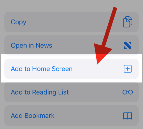
To add this web app to your homescreen, click on the "Share" icon
![]()
Then click on "Add to Home"

To add this web app to your homescreen, click on the "Share" icon
![]()
Then click on "Add to Home"

It looks like your browser doesn't natively support "Add To Homescreen", or you have disabled it (or maybe you have already added this web app to your applications?)
In any case, please check your browser options and information, thanks!
It looks like your browser doesn't natively support "Add To Homescreen", or you have disabled it (or maybe you have already added this web app to your applications?)
In any case, please check your browser options and information, thanks!


