2024 - NOV - 05

November 5, 2024
 |
|
|
|
For Beginners and Novices Part 1 |
|
Understanding the Mobile-First Personal Website Interface |
|
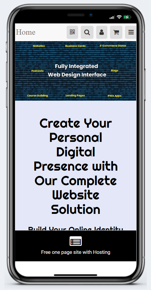
In today's digital age, more and more people are using their mobile devices to access the internet. As a result, having a mobile-first design for your personal website has become more important than ever. But what exactly is a mobile-first design, and why is it so important?
Let's break it down.
What is Mobile-First Design?
Mobile-first design is a design philosophy that emphasizes designing for smaller screens, such as those on smartphones and tablets, before designing for larger screens like laptops and desktops. This approach prioritizes the needs of mobile users, ensuring that they have the best possible experience when visiting your site.
The Importance of a Mobile-First Approach for Personal Websites
With more than half of all web traffic now coming from mobile devices, it's clear that a mobile-first approach is critical. It ensures that your website is accessible and functional for the majority of your audience. Additionally, search engines like Google prioritize mobile-friendly websites in their rankings, meaning a mobile-first approach can also improve your site's visibility and SEO. |
|
Navigating the Desktop - Stroller Plan |
|
Understanding the MobileFirst-Personal Interface - Part 1 |
|
Desktop |
|
The Mobile-First Personal Website Interface: Exploring the Differences Between Plans
When it comes to the mobile-first personal website interface, the desktop experience remains consistent across all plans. However, the lefthand menu may display different active buttons, depending on the specific plan you're using.
Let's take a closer look at the two graphics provided:
The Stroller Self-Teaching Plan
The first graphic showcases the desktop features available with the Stroller teaching plan. This is essentially a "working sandbox" that allows you to familiarize yourself with the interface and its various features and actions as you create your first digital asset.
In this plan, the lefthand menu only displays the following options: - Home - Help and Support - The Academy - Main Modules - Mobile and Desktop Sites
This simplified menu gives you a streamlined introduction to the essential elements of the interface.
The Influencer Plan
The second graphic depicts the same basic desktop interface, but this time it's from the Influencer plan. This plan unlocks all the available features and modules, providing you with a more comprehensive set of tools and options.
While the Influencer plan offers more robust features, the overall look and feel of the desktop interface remains consistent across all the different plans. This means that even as you upgrade or change your plan, the general layout and navigation of the desktop experience will remain familiar to you.
The key takeaway is that the desktop interface provides a stable and consistent foundation, while the specific features and menu options may vary depending on the plan you're using. This allows you to maintain a seamless transition as you explore the different capabilities of the mobile-first personal website interface. |
|
Tip of The Day |
|
It is easy to expand and contract the lefthand menu. Just look for the small icon at the top left beside the MobileFirat-Personal Websites logo. The little square just to the right toggles the icon and expanded menu view. |
|
For Intermediate Designers Part 1 |
|
Techniques for Mobile-First Personal Website Interface |
|
As you advance in your journey of creating a mobile-first personal website, it's important to focus on not just making your website mobile-friendly, but also enhancing the user experience. A site that's easy to navigate, engaging, and intuitive can significantly increase user engagement and satisfaction. Here are some intermediate techniques to enhance user experience on your mobile-first personal website.
Streamlining Content and Navigation
One of the most effective ways to enhance user experience is to streamline your content and navigation. Mobile screens are small, and space is limited. Keeping your content concise and to-the-point can enhance readability and retain user attention.
In terms of navigation, consider implementing a simple, easy-to-use menu system. A common practice is to use a hamburger menu, which hides the menu options under a single icon. This saves space and keeps the interface uncluttered.
Moreover, ensure your navigation elements are easily tappable. Fingers are less precise than mouse pointers, so make sure your buttons, links, and other interactive elements are large enough to be easily tapped on a touchscreen. |
|
Q/A Questions |
|
Q: What is the importance of designing a mobile-first website? A: Mobile-first websites are crucial in today's digital landscape as mobile usage continues to increase exponentially. By prioritizing mobile design, websites can provide a better user experience for mobile users and improve overall performance.
Q: How can a mobile-first website improve search engine rankings? A: Google's algorithm now prioritizes mobile-friendly websites in search results. By optimizing for mobile first, websites can improve their chances of ranking higher in search engine results pages and attract more organic traffic.
Q: What are some best practices for designing a mobile-first website? A: Some best practices for designing a mobile-first website include prioritizing speed and performance, using adaptive design techniques, simplifying navigation, optimizing images and videos for mobile viewing, and utilizing mobile-friendly forms and buttons. |
|
For Advanced Developers Part 1 |
|
Personalization and Contextual Experiences using the Mobilefirst-Personal Interface |
|
Personalization and contextual experiences have become cornerstones of modern user experience design. These advanced techniques allow websites to tailor content and features to individual users, resulting in a more engaging and satisfying user experience. Let's delve into how you can apply these techniques to your mobile-first personal website.
Tailoring Content and Features Based on User Data
The first step towards a personalized website experience lies in understanding your users. By collecting user data, such as browsing behavior, user preferences, or demographic information, you can tailor your website’s content and features to their specific needs and interests.
For instance, if your website includes a blog, you could recommend articles based on what the user has previously read. Or if your website sells products or services, you could suggest items based on the user's past purchases or browsing behavior.
Remember, it's crucial to inform users and get their consent before collecting and using their data. Privacy is a fundamental user right that should always be respected. |
|
Secret Little Hack |
|
Optimize images and videos for faster loading times to improve user experience. |
 |
|
Interested in advertising to our incredible readers? Sponsor MobileFirst-Personal Websites
Update your email preferences or unsubscribe here Your Address, City, State, Zip, USA |
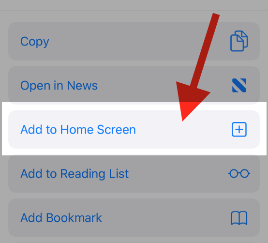
To add this web app to your homescreen, click on the "Share" icon
![]()
Then click on "Add to Home"

To add this web app to your homescreen, click on the "Share" icon
![]()
Then click on "Add to Home"

It looks like your browser doesn't natively support "Add To Homescreen", or you have disabled it (or maybe you have already added this web app to your applications?)
In any case, please check your browser options and information, thanks!
It looks like your browser doesn't natively support "Add To Homescreen", or you have disabled it (or maybe you have already added this web app to your applications?)
In any case, please check your browser options and information, thanks!


