Our Blog
Mobile-First Forms That Convert (2026)

You've done the hard work. Someone found your website, read about your services, and decided they want to reach out.
Then they hit your contact form on their phone — and give up.
The field is too small to type in. The keyboard blocks half the form. The submit button is hidden below the fold. They close the tab and never come back.
This is one of the most common and most fixable conversion killers for freelancers and small businesses. And it's entirely caused by building forms for desktop users in a world where most of your potential clients are on mobile.
This guide explains what mobile-first business forms are, why they directly impact your revenue and your Google rankings, and exactly how to build forms that feel frictionless on a smartphone.
What Are Mobile-First Business Forms?
A mobile-first business form is a web form designed and optimized for smartphone users first — before being adapted for larger screens.
It's not just a form that "works" on mobile. It's a form where:
- Every field is easy to tap and fill in with thumbs
- The keyboard doesn't obscure what the user is typing
- The layout is single-column and logical on a small screen
- The submit button is visible without scrolling
- The form uses the right keyboard type for each field (email keyboard for email, number pad for phone numbers)
- It loads fast and doesn't require scrolling through a wall of questions
Most forms you encounter on small business websites fail at least three of these. That's a problem, because forms are the most critical conversion point in your entire digital presence.
Why Mobile-First Forms Directly Impact Your Business
The Conversion Problem
According to consistent research on mobile UX, form abandonment on mobile is significantly higher than on desktop — especially on forms that weren't designed with mobile users in mind.
Every abandoned form is a lead you lost. For a freelancer or local business owner, that could be a $2,000 project, a recurring client, or a referral partner. The lost revenue compounds invisibly over time.
The SEO Connection
Here's what most people don't connect: form usability affects your Google rankings.
How? Through engagement signals. When someone visits your site, opens your contact page, and immediately leaves without interacting — that bounce signal tells Google the page didn't satisfy the visitor's intent.
A mobile-first business form keeps visitors on your page longer. They engage, they type, they submit. That engagement sends positive signals to Google's algorithm and, over time, improves your rankings for queries like "contact [your service] [your city]" and similar local intent searches.
The Trust Factor
A polished, easy-to-use form on mobile signals professionalism. It tells the potential client: this person has thought about my experience, not just their own needs.
Conversely, a clunky, hard-to-fill form on mobile signals the opposite — and if someone is choosing between two freelancers or two local businesses, that friction can be the deciding factor.
The 7 Elements of a Great Mobile-First Business Form
1. Single-Column Layout
On a small screen, multi-column forms require horizontal scrolling or zooming. Every field should stack vertically in a single column. Clean. Simple. Readable.
2. Appropriately Sized Tap Targets
Input fields should be tall enough to tap easily — minimum 44px height. Labels should be above the field, not inside it (placeholder text disappears the moment someone starts typing, which is confusing).
3. Smart Keyboard Types
This is a small detail with a big impact on mobile UX. Set the correct inputmode or type attribute on each field:
- Email address →
type="email"(shows @ and .com on the keyboard) - Phone number →
type="tel"(shows a number pad) - URL →
type="url"(shows . and / on the keyboard) - Regular text →
type="text"
Getting this right means the user's phone automatically brings up the most efficient keyboard for each field.
4. Minimal Required Fields
Every additional field you add increases form abandonment. For an initial contact or inquiry form, you typically only need:
- Name
- Email (or phone — pick one as primary)
- A brief description of what they need
Anything else can be collected in a follow-up email or onboarding process. Respect the mobile user's time.
5. Visible Submit Button (No Scrolling Required)
On a phone, if your submit button is below the fold — especially below a keyboard — users will miss it or feel unsure that submitting is even possible. The submit button should be:
- Clearly visible after filling in the last field
- Large enough to tap confidently (minimum 48px height)
- Labeled with an action: "Send Message," "Get a Free Quote," "Book a Call" — never just "Submit"
6. Inline Validation
Don't wait until the user hits "submit" to tell them their email format is wrong. Show validation feedback in real time, next to each field, as they type. This prevents the frustrating experience of filling out a whole form only to find out there's an error somewhere.
On mobile, scrolling back up to find and fix an error is extra annoying. Prevent it entirely with inline validation.
7. Confirmation Feedback
After someone submits, what happens? If the page just refreshes and nothing changes, many mobile users will assume it didn't work and submit again — or leave frustrated.
Show a clear, mobile-friendly confirmation: a full-screen success message, or at minimum a bold, visible "Your message was received! We'll be in touch within 24 hours." placed where the form used to be.
Types of Business Forms That Work Better Mobile-First
Contact & Inquiry Forms
The most common form type for freelancers and service businesses. Keep it to 3–4 fields max. The goal is to start a conversation, not collect a full client brief.
Project Proposal Request Forms
If you offer custom services, a slightly longer form can work — but only if it's broken into steps. A multi-step form on mobile is far less overwhelming than a single long form. Show one or two questions per step with a progress indicator.
Booking & Appointment Forms
If you take calls or consultations, an integrated calendar booking form is one of the highest-converting tools available. On mobile, the calendar picker and time selection need to be touch-native — large enough to tap, not a tiny date picker built for a mouse.
Newsletter Sign-Up Forms
The simplest form type: just an email field and a button. But even this can fail on mobile if the button is too small, the placeholder text is too light to read in sunlight, or the confirmation doesn't appear.
Intake & Onboarding Forms
For existing clients, intake forms are often long and detailed. These should always be multi-step on mobile, with progress saved automatically so clients can complete them in stages without losing their work.
Common Mobile Form Mistakes to Fix Right Now
Take five minutes and check your existing forms for these issues:
❌ Placeholder text as labels When someone starts typing, the placeholder disappears. They can no longer see what the field is for. Use persistent labels above each field.
❌ Tiny input fields If your input fields are 28–30px tall, they're desktop fields. Mobile needs 44–48px minimum.
❌ Multi-column layout on mobile Open your contact form on your own phone right now. If fields are side by side, they're wrong.
❌ No keyboard type attributes Check if your email field brings up the regular keyboard or the email keyboard. If it's the regular keyboard, you're missing a small but meaningful UX improvement.
❌ Generic submit button "Submit" converts worse than action-oriented labels. Change it to something specific to your business: "Request My Free Quote" or "Let's Talk."
❌ No mobile confirmation After testing a submission, look at what happens on a phone screen. Is the confirmation visible without scrolling? Is it clear enough that the user doesn't second-guess whether it worked?
Tools for Building Mobile-First Business Forms
You don't need to build forms from scratch. Here are your options:
Platforms with Native Mobile-First Forms Platforms like MobileFirst Personal are built to produce forms that are already optimized for mobile — correct tap targets, single-column layout, mobile-native inputs. No configuration required.
Form-Specific Tools (with mobile optimization) Typeform and Tally are known for clean, mobile-friendly multi-step forms. They handle the mobile UX well, though you'll need to embed them into your existing site.
Custom Development If you're working with a developer, specify mobile-first form design in your brief. Reference this article's 7 elements as your requirements.
The SEO Checklist for Your Contact/Forms Page
Because your forms page is often where high-intent visitors land, its SEO matters:
- Page title includes your service + location (e.g., "Contact [Your Name] — Freelance Web Developer in Toronto")
- Meta description includes a benefit and a CTA ("Ready to start your project? Send a message — we respond within 24 hours.")
- The page loads in under 3 seconds on mobile
- H1 heading is clear and relevant (e.g., "Get in Touch" or "Request a Free Quote")
- Form is embedded natively, not behind a button that requires another tap to open
- Page is included in your sitemap and indexed in Google Search Console
- No unnecessary JavaScript that delays the form from appearing
A mobile-first business form is not a design nicety. It's a revenue-protection strategy.
Every freelancer and small business owner who generates leads through their website has a forms page. Very few have made it genuinely mobile-first. That gap is your competitive advantage — if you close it before your competitors do.
Start by auditing your existing forms today. Open your contact page on your phone and go through each of the 7 elements. Fix the biggest issues first. Then set a reminder to audit again in 30 days.
The clients who almost reached out but didn't — they're still out there. A better mobile form is how you catch them next time.
Want a platform that builds mobile-first forms into your business presence automatically? Explore MobileFirst Personal →
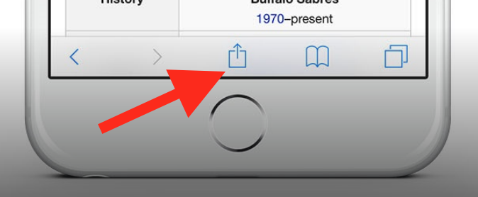
To add this web app to your homescreen, click on the "Share" icon
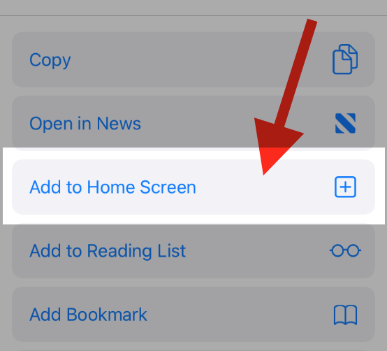
Then click on "Add to Home"
To add this web app to your homescreen, click on the "Share" icon
Then click on "Add to Home"
It looks like your browser doesn't natively support "Add To Homescreen", or you have disabled it (or maybe you have already added this web app to your applications?)
In any case, please check your browser options and information, thanks!
It looks like your browser doesn't natively support "Add To Homescreen", or you have disabled it (or maybe you have already added this web app to your applications?)
In any case, please check your browser options and information, thanks!