Our Blog
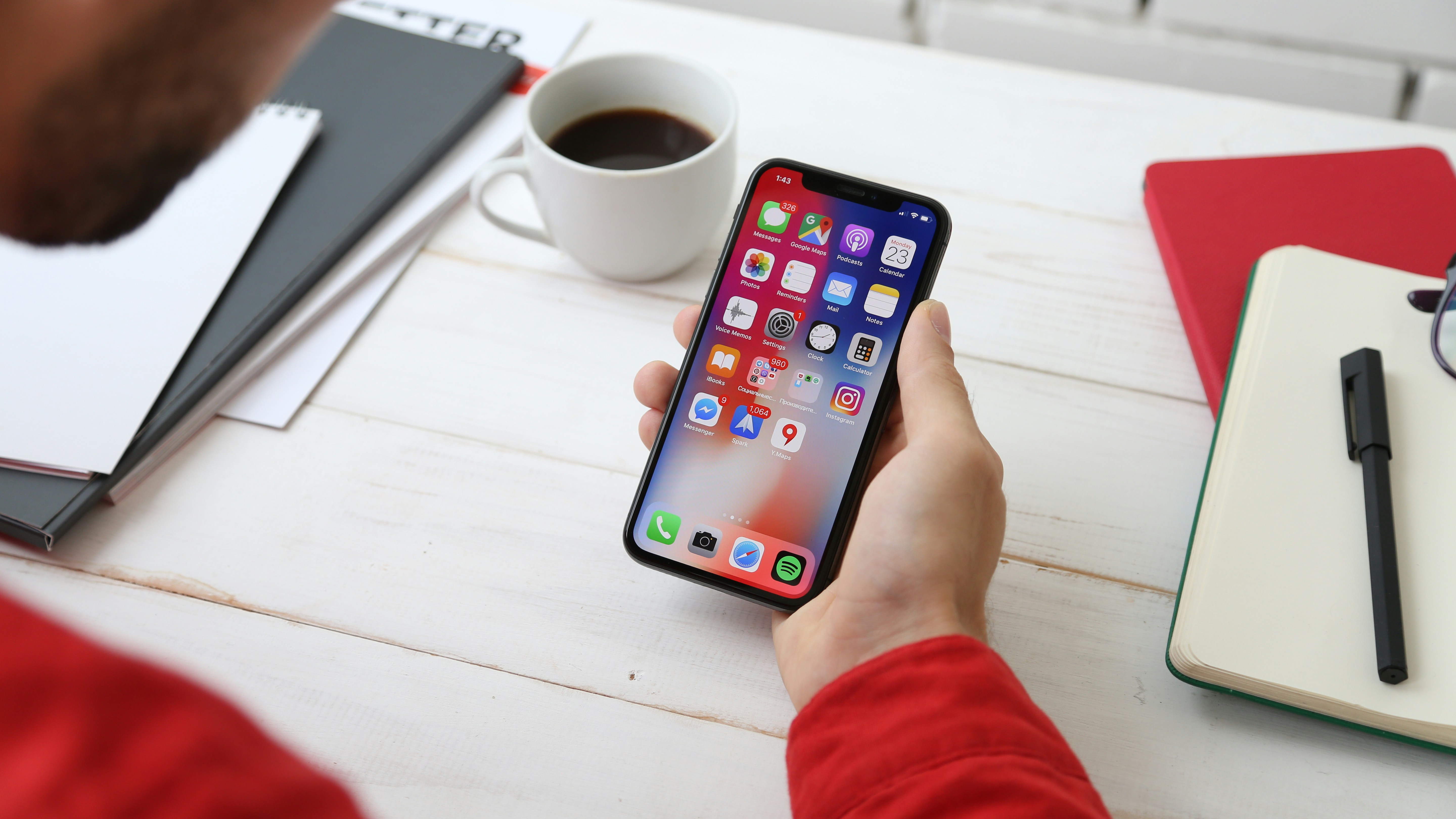
Mobile-First Web App: The 2026 Guide
If you've ever lost a client because your website looked broken on their phone this guide is for you. More than 60% of all web traffic now comes from mobile devices. Yet most small business websites, freelancer portfolios, and solopreneur platforms are still built as desktop-first experiences that someone adapted for mobile. That gap is costing you clients, search rankings, and credibility.
This guide breaks down exactly what a mobile-first web app is, why it's different from a "mobile-friendly" site, and what it actually looks like in practice for freelancers, local business owners, and remote workers who want a professional digital presence that works everywhere.
What Is a Mobile-First Web App?
A mobile-first web app is a web application designed and built starting from the smallest screen the smartphone before scaling up to tablets and desktops.
It's not just a website that looks okay on mobile. It's a digital product where:
- The layout, navigation, and content are planned for a 390px screen first
- Performance is optimized for mobile networks (3G/4G), not just home Wi-Fi
- Touch interactions (tap, swipe, scroll) are the primary input method by default
- Core features work offline or on slow connections using modern web technologies like Progressive Web Apps (PWAs)
Think of it this way: a mobile-friendly site is a house with a back door that fits a wheelchair. A mobile-first web app is a house that was designed from day one to be fully accessible hallways wide enough, ramps instead of stairs, light switches at the right height for everyone.
Mobile-First vs. Mobile-Friendly: What's the Real Difference?
Most people confuse these two terms. Here's the honest breakdown:
| Feature | Mobile-Friendly | Mobile-First Web App |
|---|---|---|
| Design starting point | Desktop → shrunk down | Mobile → scaled up |
| Load speed on 4G | Average (3–5s) | Fast (under 2s) |
| Offline capability | Usually none | Often available (PWA) |
| Google ranking boost | Partial | Full (Core Web Vitals) |
| User experience on phone | Acceptable | Native app-like |
| Built for touch | Adapted | Designed for it |
Google's algorithm has been mobile-first indexed since 2019 meaning it crawls and ranks your site based on the mobile version first. If your mobile experience is weak, your desktop rankings suffer too.
Why Mobile-First Web Apps Matter for Freelancers and Small Businesses
You're not building the next Facebook. You need a platform that:
- Shows up on Google when local clients search for what you do
- Loads fast when a busy business owner opens it on their iPhone during a commute
- Converts visitors into booked calls or signed proposals
- Works like an app without asking people to download anything
That last point is huge. Research consistently shows that users abandon sites that take more than 3 seconds to load on mobile. For a freelancer or solopreneur, every abandoned visit is a potential client who just went to your competitor.
A mobile-first web app solves all four of these. It's fast, it ranks well on Google, it looks polished on every device, and it gives clients a smooth, trustworthy experience the kind that makes them feel confident handing you their business.
5 Core Features of a Real Mobile-First Web App
1. Responsive-First Layout (Not Just Responsive)
The design starts at 320–390px wide and expands gracefully. Images don't overflow. Text doesn't require horizontal scrolling. Buttons are large enough to tap with a thumb.
2. Optimized Performance (Core Web Vitals)
Google measures three key signals:
- LCP (Largest Contentful Paint): How fast your main content loads target under 2.5s
- FID / INP (Interaction to Next Paint): How quickly the page responds to a tap target under 200ms
- CLS (Cumulative Layout Shift): How much the page jumps around while loading target under 0.1
A mobile-first web app is built to pass all three.
3. Progressive Web App (PWA) Capabilities
PWAs are web apps that behave like native mobile apps. They can:
- Be added to your phone's home screen (no app store required)
- Load instantly on repeat visits via caching
- Send push notifications
- Work offline or on spotty connections
For a freelancer or small business, this means your clients can "save" your platform to their home screen and open it like an app without you paying $20,000 to build an iOS and Android app.
4. Touch-Native UI
Every interaction is designed for fingers, not mice. That means:
- Larger tap targets (minimum 44x44px)
- Swipeable elements where appropriate
- No hover-dependent menus
- Readable font sizes (minimum 16px body text)
5. Fast, Secure Hosting (HTTPS + CDN)
Mobile-first web apps are deployed on fast infrastructure usually with a Content Delivery Network (CDN) that serves files from the closest server to each user. Combined with HTTPS (required for PWA features), this ensures both security and speed.
Who Needs a Mobile-First Web App?
Here are the people who benefit most:
Freelancers building a personal brand and booking clients online. Your portfolio, services, and contact form need to be flawless on mobile because that's where potential clients will first see you.
Local business owners who want to show up in "near me" Google searches. Local SEO and mobile-first design are deeply connected Google prioritizes mobile-optimized sites in local results.
Solopreneurs selling digital products or consulting services. A slow, clunky mobile experience kills trust before you've said a single word.
Remote workers who want a professional home on the web. Your personal site is your resume, portfolio, and first impression it should work perfectly on every device.
Final-year students entering the workforce or launching freelance careers. A mobile-first personal site sets you apart from classmates who still have a desktop-only WordPress template from 2015.
How to Get a Mobile-First Web App (Without Being a Developer)
You don't need to code. You have three main options:
Option 1: Use a Mobile-First Website Builder Tools like MobileFirst Personal let non-technical users build mobile-first platforms through a visual interface. No code required, and the output is already optimized for Google's mobile-first indexing.
Option 2: Hire a Mobile-First Developer If you have a specific vision or need custom functionality, hiring a developer who specializes in mobile-first architecture is worth the investment. Look for someone who mentions PWA, Core Web Vitals, and responsive-first design in their process.
Option 3: Use a Framework That Forces Mobile-First Developers often use CSS frameworks like Tailwind CSS or Bootstrap that apply mobile-first breakpoints by default. This ensures the codebase is built the right way from the start.
The SEO Connection: Why Google Loves Mobile-First Web Apps
Here's something most people miss: mobile-first design is not just a UX decision it's an SEO decision.
Since Google switched to mobile-first indexing, sites that score well on Core Web Vitals (which are largely measured on mobile) rank higher across the board even for desktop searches.
What this means for you:
- Better load times → lower bounce rate → higher rankings
- Better Core Web Vitals scores → Page Experience ranking signals
- PWA features → higher user engagement → better dwell time
- Touch-native UI → fewer frustrated users leaving immediately
Every one of these signals feeds back into Google's algorithm and lifts your rankings over time.
Quick Start Checklist: Is Your Current Site Mobile-First?
Run through this in under 5 minutes:
- Open your site on your own phone does everything look intentional, or just "okay"?
- Go to PageSpeed Insights and run a mobile test are you scoring above 70?
- Check if your site loads in under 3 seconds on a 4G connection
- Try tapping your main navigation are buttons large enough?
- Search your main keyword on Google from your phone are you on page 1?
If you answered "no" or "I'm not sure" to more than two of these, you're leaving clients and rankings on the table.
A mobile-first web app isn't a luxury for big companies with big budgets. In 2026, it's the baseline expectation for anyone who wants to be taken seriously online especially freelancers and small business owners competing for attention in a crowded market.
The good news: getting there is more accessible than ever. Whether you build it yourself, hire someone, or use a purpose-built platform, the path to a fast, professional, mobile-first presence is clear. Start with the audit above. Then build forward.
Looking to launch your own mobile-first web app without writing a single line of code? Explore MobileFirst Personal →
To add this web app to your homescreen, click on the "Share" icon
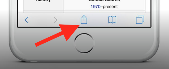
Then click on "Add to Home"
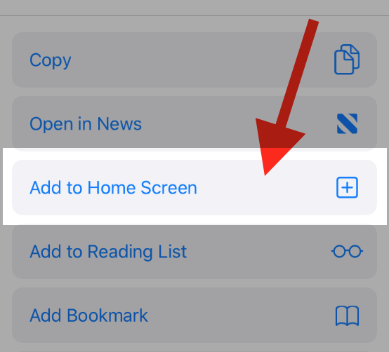
To add this web app to your homescreen, click on the "Share" icon
Then click on "Add to Home"
It looks like your browser doesn't natively support "Add To Homescreen", or you have disabled it (or maybe you have already added this web app to your applications?)
In any case, please check your browser options and information, thanks!
It looks like your browser doesn't natively support "Add To Homescreen", or you have disabled it (or maybe you have already added this web app to your applications?)
In any case, please check your browser options and information, thanks!