Our Blog

How to Pick a Mobile-First Website Builder
There are hundreds of website builders out there. Almost all of them claim to be "mobile-friendly." Very few are genuinely built mobile-first.
That distinction matters more than most people realize especially if you're a freelancer, local business owner, or solopreneur trying to grow your client base through organic search.
This guide walks you through exactly what to look for in a mobile-first website builder, the questions you need to ask before choosing one, and the features that separate a real mobile-first platform from one that just added a "responsive" checkbox.
Why "Mobile-Friendly" Isn't Enough Anymore
Let's get this out of the way first.
In 2026, saying your website builder is "mobile-friendly" is like saying your car has seatbelts. It's the bare minimum. Google has ranked websites based on their mobile version first since 2019 this is called mobile-first indexing.
What that means in practice: if your site performs poorly on a smartphone slow load times, awkward layouts, tiny tap targets Google will rank you lower, even for desktop searches.
A genuine mobile-first website builder doesn't just resize your desktop design. It starts from the mobile experience and expands up. The result looks and performs fundamentally differently.
What Makes a Website Builder Truly Mobile-First?
Before comparing any tools, here are the six criteria that actually matter:
1. Design Philosophy: Mobile-Up, Not Desktop-Down
Does the builder design for mobile screens first? Or does it create a desktop layout and then apply "responsive" rules to shrink it?
The easiest way to test this: create a basic page, then view it on your phone before touching any mobile settings. If it already looks intentional proper spacing, readable fonts, clean layout the builder is mobile-first by design. If you need to manually adjust a dozen things, it's not.
2. Core Web Vitals Performance
Google uses three measurable signals to assess page experience:
- LCP (how fast the main content loads) target under 2.5 seconds
- INP (how fast the page responds to your tap) target under 200ms
- CLS (how stable the page is while loading) target under 0.1
Ask any website builder for their average Core Web Vitals scores on mobile. If they can't answer, or if the scores are below 70 on Google PageSpeed Insights, move on.
3. PWA (Progressive Web App) Support
PWA support means your site can behave like a native mobile app installable on a home screen, fast on repeat visits, capable of offline use. For freelancers and solopreneurs, this creates a sticky experience that keeps clients coming back.
Not every builder needs this, but if you're building a client portal, online course platform, or booking system, PWA support is a significant advantage.
4. SEO Foundations Built In
A mobile-first builder should handle the technical SEO basics automatically:
- Editable title tags and meta descriptions on every page
- Clean URL structure (no
/page?id=123nonsense) - Automatic sitemap generation and submission
- Schema markup support (especially LocalBusiness for local SEO)
- Fast HTTPS hosting on a CDN
If you have to install five plugins to get these basics, the platform isn't built for search visibility.
5. Touch-Native UI Components
Buttons, forms, navigation menus, and interactive elements should all be designed for fingers by default. Look for:
- Minimum 44×44px tap targets
- No hover-only interactions
- Swipeable galleries or carousels
- Large, legible form fields
6. Speed of Building vs. Quality of Output
The best mobile-first builders don't make you choose between speed and quality. You should be able to go from zero to a published, professional page in under an hour without sacrificing performance or design integrity.
6 Questions to Ask Before Choosing a Mobile-First Website Builder
Use these to cut through marketing copy and evaluate any platform objectively:
Q1: "What is the average mobile PageSpeed score for sites built on your platform?" Anything below 70 is a red flag. Aim for 85+.
Q2: "Does the editor start from a mobile view or a desktop view?" A truly mobile-first builder defaults to the mobile viewport in its editor.
Q3: "What does a published page look like on mobile before any customization?" Request a demo or test a free template. The raw mobile output tells you everything about the platform's actual priorities.
Q4: "How does your platform handle Google's Core Web Vitals?" Look for a concrete answer, not "we're working on it."
Q5: "Can I edit my title tags, meta descriptions, and URLs without a plugin?" On-page SEO should be native, not bolted on.
Q6: "Does the platform support Progressive Web App (PWA) features?" Especially important if you want clients to access your platform like an app.
The Hidden Cost of Choosing the Wrong Builder
This is what most comparison guides don't tell you.
Switching website builders later is expensive in time, money, and SEO equity. When you migrate a site, you risk:
- Losing existing search rankings if redirects aren't set up correctly
- Rebuilding every page from scratch in a new system
- Downtime that signals instability to Google
- Losing reviews, testimonials, or social proof tied to the old URL
Getting the right mobile-first platform from the beginning is not just a design decision it's a business continuity decision.
What Type of Builder Do You Actually Need?
The right mobile-first website builder depends on what you're building. Here's a quick decision tree:
You're a freelancer or solopreneur building a personal brand: → You need a platform that's fast to set up, looks professional on mobile, and has strong SEO defaults. You don't need complex e-commerce or CMS features. Prioritize speed, design quality, and ease of content updates.
You're a local business owner: → You need Local SEO features built in Google Business Profile integration, LocalBusiness schema, location-specific page templates, and fast mobile load times. Your customers are finding you on their phones while they're out and about.
You're building a client portal or online community: → You need PWA capabilities, user authentication, and a mobile-native dashboard experience. A standard website builder probably isn't the right tool look for platforms designed specifically for web apps.
You're a final-year student creating a portfolio: → Speed matters less than design impact here, but mobile optimization is still critical. A recruiter or potential client opening your portfolio on their phone should get the full experience.
Red Flags to Watch for in Any Website Builder
Avoid platforms that:
- Use heavy page builders that bloat load times some drag-and-drop editors add 500KB+ of unnecessary JavaScript to every page
- Don't let you control your URL structure you should be able to set
/blog/mobile-first-web-appnot/p/1234 - Lock you into proprietary hosting with no export option if you need to leave, you should be able to take your content with you
- Charge extra for basic SEO features meta descriptions and sitemaps should never be a premium add-on
- Have no published Core Web Vitals data if they're not publishing it, the numbers are probably not good
The Mobile-First Builder Checklist
Before signing up for any platform, tick these off:
- Mobile editor view is the default (not an afterthought)
- PageSpeed mobile score is above 80 on a sample published page
- Title tags and meta descriptions are editable on every page
- Clean URL structure without page IDs or query strings
- Automatic sitemap generation and submission to Google
- HTTPS included by default
- No unnecessary JavaScript bloat on basic pages
- Touch-native UI components (buttons, forms, menus)
- Export option or data portability (so you're never locked in)\
Why Building Mobile-First From Day One Pays Off
Here's the compounding effect most people miss:
When you launch on a mobile-first platform:
- Google indexes your mobile version and rewards you with better rankings
- Visitors on mobile have a good experience, so they stay longer
- Longer dwell time signals relevance to Google → better rankings
- Better rankings → more impressions → more clicks
- More clicks → more clients, more revenue, more reviews
- More reviews and engagement → even better local SEO
This flywheel doesn't start spinning if your mobile experience is broken. It only works if mobile is treated as the primary experience from the beginning.
Choosing a mobile-first website builder isn't about finding the one with the most templates or the lowest price. It's about finding the platform that treats mobile performance, SEO, and user experience as core features not optional upgrades. Use the checklist above, ask the six questions, and test the mobile output before you commit to anything. Your clients are finding you on their phones. Make sure what they find is worth staying for.
Want a mobile-first platform built specifically for freelancers and solopreneurs? See how MobileFirst Personal works →
To add this web app to your homescreen, click on the "Share" icon
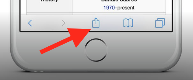
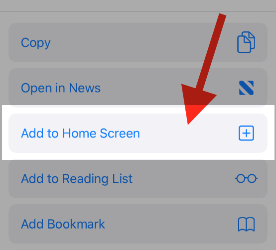
Then click on "Add to Home"
To add this web app to your homescreen, click on the "Share" icon
Then click on "Add to Home"
It looks like your browser doesn't natively support "Add To Homescreen", or you have disabled it (or maybe you have already added this web app to your applications?)
In any case, please check your browser options and information, thanks!
It looks like your browser doesn't natively support "Add To Homescreen", or you have disabled it (or maybe you have already added this web app to your applications?)
In any case, please check your browser options and information, thanks!