Our Blog

Build a Mobile-First PWA in 2026
Imagine your clients opening your business platform directly from their phone's home screen no app store, no download, no waiting. It loads instantly, works on spotty Wi-Fi, and feels as smooth as a native app.
That's what a mobile-first Progressive Web App (PWA) does.
In 2026, PWAs are one of the most underused advantages available to freelancers and small business owners. They combine the reach of a website with the experience of a mobile app and they're more accessible to build than most people think.
This guide walks you through what a mobile-first PWA actually is, why it matters for your business, and exactly how to build one step by step no computer science degree required.
What Is a PWA?
A Progressive Web App is a website that has been enhanced with modern browser features so it behaves like a mobile app.
The word "progressive" means it works for everyone whether someone has the latest iPhone on fast 5G or an older Android on a weak 3G signal. It loads fast, responds immediately, and gives users a clean, app-like experience without the friction of an app store.
A mobile-first PWA specifically means the app was designed starting from the mobile screen not adapted from desktop. This combination is what makes it powerful for small businesses and solopreneurs.
What Makes Something a PWA?
Three things define a real PWA:
1. Served over HTTPS The connection must be secure. This is also required for good SEO and modern browser features.
2. A Web App Manifest A small JSON file that tells the browser: "This is an installable app. Here's the icon, the name, the theme color." This is what enables the "Add to Home Screen" prompt.
3. A Service Worker A background script that caches your content, enables offline use, and makes the app fast on repeat visits. Think of it as a smart pre-loader that works even when the user has no internet.
Why Should Freelancers and Small Business Owners Care?
Here's the business case no tech jargon needed.
It Makes You Look More Professional
When a client can tap a button on your website and "install" your platform on their home screen right next to Instagram and their banking app it sends a message: this person is serious about their business.
It Reduces Friction to Re-Engage
Most people don't bookmark websites. But they do keep apps on their home screen. A PWA gets you a permanent spot in the most valuable real estate on your client's phone their home screen without requiring them to go to an app store.
It Works on Bad Connections
A client in a rural area, on a train, or at a conference with overloaded Wi-Fi can still access your booking form, portfolio, or client portal because a PWA caches what it needs. That reliability builds trust.
It's Fast And Speed = Conversions
PWAs load near-instantly on repeat visits because the core app shell is cached locally. Faster load → lower bounce rate → more conversions.
It Costs a Fraction of a Native App
A custom iOS and Android app typically costs $15,000–$50,000+ to build and maintain. A mobile-first PWA can achieve 80% of the same functionality for a small fraction of that or even for free if you use the right platform.
Step-by-Step: How to Build a Mobile-First PWA in 2026
Step 1: Define Your App's Core Job
Before touching any tools, answer this question: What is the one thing your PWA must do well on a phone?
For a freelancer, it might be: "Let potential clients browse my portfolio and book a discovery call." For a local business, it might be: "Let customers see our services, check availability, and contact us."
Your answer shapes every decision after this. A focused PWA is always better than a bloated one.
Step 2: Choose Your Build Path
There are three routes depending on your technical comfort level:
Route A No-Code PWA Builder (Recommended for Non-Developers) Platforms like MobileFirst Personal, Glide, or Bubble let you build a PWA through a visual interface. You configure your pages, add content, and the platform handles the manifest and service worker automatically.
Best for: Freelancers, solopreneurs, and small business owners who want results without a learning curve.
Route B Use a PWA-Ready Framework (For Developers) Frameworks like Next.js, Nuxt.js, and Gatsby have PWA plugins that handle the technical requirements. You build the app, add the PWA layer on top.
Best for: Developers or technically confident founders building custom functionality.
Route C Convert an Existing Website If you already have a website on a platform that supports PWA features (like some versions of WordPress with the right plugin), you may be able to add a manifest and service worker without rebuilding from scratch.
Best for: Businesses with an existing site that just needs a PWA upgrade.
Step 3: Design Mobile-First (Not Mobile-Later)
This is where most people get it wrong. They design the full desktop experience, then try to make it work on mobile.
Start with a 390px wide canvas. Every decision navigation, button placement, text size, image ratios should work perfectly at that width first.
Key mobile-first design rules:
- Navigation: use a bottom nav bar or hamburger menu (not a top horizontal nav with 8 items)
- Typography: body text at minimum 16px, headings at 24px+
- Buttons: minimum 44×44px tap target, with enough spacing between clickable elements
- Images: use WebP format, lazy loading, and responsive
srcsetattributes - Forms: large input fields, autofill-friendly labels, single-column layout
Step 4: Optimize for Core Web Vitals
Google measures your PWA's performance through three Core Web Vitals signals. Getting these right boosts both your search rankings and user experience.
LCP Largest Contentful Paint (target: under 2.5 seconds) The biggest visible element on your page should load fast. Tips:
- Use a CDN to serve images and assets from the closest server
- Compress all images to WebP
- Remove render-blocking JavaScript
INP Interaction to Next Paint (target: under 200ms) When a user taps something, the app should respond immediately. Tips:
- Minimize heavy JavaScript on the main thread
- Use optimistic UI patterns (show feedback before the server confirms)
CLS Cumulative Layout Shift (target: under 0.1) Nothing should jump around as the page loads. Tips:
- Always set explicit width and height on images
- Reserve space for dynamic content (ads, embeds, loaded fonts)
Step 5: Add the PWA Layer
If you're using a no-code builder, this often happens automatically. If you're building manually, you need two things:
- Web App Manifest (manifest.json)
- Service Worker (sw.js) At minimum, your service worker should cache your core app shell (HTML, CSS, JS) on the first visit so subsequent visits load instantly. Most modern frameworks generate this automatically.
Step 6: Test Before Publishing
Run these checks before going live:
- Google Lighthouse Audit Open Chrome DevTools → Lighthouse → Run on Mobile. Aim for 90+ on Performance and PWA.
- PageSpeed Insights at pagespeed.web.dev Check your mobile score. Target 80+.
- Add to Home Screen test On your phone, visit your site and check that the browser prompts you to install it.
- Offline test In Chrome DevTools, switch to offline mode. Your core content should still load.
- Real device testing Test on at least two different phones (iOS and Android) and two different network speeds.
Step 7: Submit to Google Search Console
Once your PWA is live:
- Add your property in Google Search Console
- Submit your sitemap (usually at
yourdomain.com/sitemap.xml) - Use the URL Inspection tool to request indexing of your key pages
- Monitor Core Web Vitals in the Experience section
This step is often skipped don't skip it. It can cut days or weeks off the time it takes Google to discover and rank your new pages.
Common Mistakes to Avoid
Mistake 1: Building a great desktop app that "also works on mobile" If your design process starts on a 1440px screen, you're not building mobile-first. Start small, scale up.
Mistake 2: Ignoring the service worker A PWA without a service worker is just a website with a manifest. The service worker is what enables speed, offline support, and installability.
Mistake 3: Not testing on real devices Browser simulators lie. A real iPhone and a real Android on a real 4G connection will show you problems you'd never catch in a DevTools preview.
Mistake 4: Skipping Google Search Console submission You can build the most perfectly optimized PWA in the world, but if you don't tell Google it exists, you'll wait much longer to see search traffic.
Mistake 5: Treating performance as a one-time task Core Web Vitals change as you add content, images, and features. Set a calendar reminder to run a Lighthouse audit once a month.
What to Expect After Launch
Here's an honest timeline of what to expect:
Week 1–2: Google discovers and indexes your PWA (faster if you submitted to Search Console)
Week 2–4: Initial impressions appear in GSC. Don't panic if click-through rates are low rankings take time.
Month 1–2: If your on-page SEO is solid and your content matches search intent, you'll start seeing movement toward page 1 for long-tail queries.
Month 2–3: Target 3–5 queries reaching top 10 positions. This is where clicks start to accumulate.
Month 3+: Compounding growth. Each piece of content builds topical authority, which lifts the whole site.
Patience + consistency beats shortcuts every time.
A mobile-first PWA is the most effective way for a freelancer or small business owner to deliver a professional digital experience in 2026 at a fraction of the cost of a native app, with better search visibility than a standard website.
The step-by-step process above gives you a clear path from zero to a published, indexed, Google-friendly PWA. The only remaining question is which build path fits your situation.
Start with Step 1 today: define the one thing your PWA must do well on a phone. Everything else follows from there.
Ready to launch your mobile-first PWA without writing code? See how MobileFirst Personal makes it possible →
To add this web app to your homescreen, click on the "Share" icon
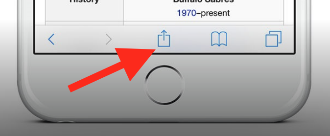
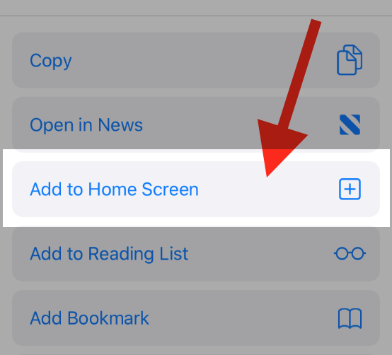
Then click on "Add to Home"
To add this web app to your homescreen, click on the "Share" icon
Then click on "Add to Home"
It looks like your browser doesn't natively support "Add To Homescreen", or you have disabled it (or maybe you have already added this web app to your applications?)
In any case, please check your browser options and information, thanks!
It looks like your browser doesn't natively support "Add To Homescreen", or you have disabled it (or maybe you have already added this web app to your applications?)
In any case, please check your browser options and information, thanks!